Color Contrast
Use these background and foreground colors together to ensure your design has enough contrast.
In 2020, the City of Saint Paul launched the Brand Upgrade Project to create consistent guidelines and update key assets—like colors, logo, and typefaces—for accessibility and digital scalability. Since then, we’ve continued to evolve and expand the brand to meet residents’ needs. Please follow these guidelines for consistency across all communications and touch points.
Last Edited: January 30, 2026
To help residents stay informed and build trust by delivering clear, consistent, and accessible communication across all City of Saint Paul platforms.
A future where every interaction with the City reflects transparency, unity, and reliability—building a brand that connects people and government seamlessly.

Inspired by Saint Paul’s many lakes, this shade of blue takes its name from the literal meaning of the Dakota word “Minnesota,” or “Land of the Sky-Tinted Waters.”
PANTONE 2133 C
CMYK: 94-67-0-0
RGB: 29-87-165
HEX: #1D57A5 / #2367D3 (web only)

Inspired by the confluence of the Mississippi and Minnesota rivers (“Big Rivers”) at B’dote, the sacred Dakota site located near the southwestern corner of Saint Paul.
PANTONE 2768 C
CMYK: 100-78-0-66
RGB: 7-29-73
HEX: #071D49

Inspired by the verdant floodplain forests, oak woodlands, prairies and other native ecosystems of Saint Paul.
PANTONE 2300 C
CMYK: 36-0-87-2
RGB: 169-194-63
HEX: #A9C23F

Inspired by the gleaming golden sculpture group at the base of State Capitol dome titled “The Progress of the State,” commonly referred to as the Quadriga.
PANTONE 143 C
CMYK: 0-27-85-0
RGB: 241-180-52
HEX: #F1B434

Sugar Maple Orange captures the vibrant warmth of Minnesota’s autumn, inspired by the brilliant hues of maple trees that light up the city each fall.
PANTONE 716 C
CMYK: 0-50-93-1 6
RGB: 214-108-15
HEX: #D66C0F

Inspired by the brilliant magenta shades of Minnesota’s state flower, Cypripedium reginae which is found living in open fens, bogs, swamps, and damp woods of Minnesota.
PANTONE 2041 C
CMYK: 4-98-27-27
RGB: 161-34-78
HEX: #A1224E

Our signature purple is inspired by the rich hues of Minnesota’s native corn, a symbol of heritage, resilience, and natural beauty.
PANTONE 7672 C
CMYK: 21-47-0-47
RGB: 107-72-135
HEX: #6B4887

Granite Gray reflects the enduring strength and timeless elegance of the Cathedral of Saint Paul’s granite façade—a foundation that grounds its soaring dome and iconic architecture.
PANTONE Warm Gray 1 C
CMYK: 10-10-11-0
RGB: 215-210-203
HEX: #D7D2CB

Inspired by the Cathedral of Saint Paul’s dramatic 120-foot-wide dome made of curved steel beams, and covered with clay tiles.
PANTONE 4287 C
CMYK: 66-62-55-54
RGB: 69-65-66
HEX: #454142

Use these background and foreground colors together to ensure your design has enough contrast.
The fonts below have been deployed to your workstations. Due to Microsoft Office 365 cloud font limitations, we are also including Microsoft Office equivalents that you can use in the Office 365 online environment (the online versions of Word, PowerPoint, etc.).
Use Red Hat Text and Open Sans whenever you are working with desktop applications like Adobe Acrobat or the desktop versions of Microsoft Office applications. These fonts should also be used for all major print jobs.
Red Hat Text should be used for headlines or whenever your design requires text elements that have greater prominence.
Open Sans should be used for body and paragraph copy, or whenever your design requires a large amount of text.
Use these equivalents whenever you are working in an online environment (Outlook Web Application and all Office applications online).
Source Sans Pro should be used for headlines or whenever your design requires text elements that have greater prominence.
Verdana should be used for body and paragraph copy, or whenever your design requires a large amount of text.
To ensure the City’s logo is used consistently, do not alter the logo lockups. Avoid any of the following alterations to the City's logo.

You are permitted to adjust the color of the mark with brand colors and adjust the branded house name (usually reserved for departments) for specific enterprise initiatives like climate action.
The City’s logo must have a minimum amount of white space or clearance surrounding it. As a rule of thumb, use the “N” in “SAINT PAUL” to measure out the minimum amount of space. All of the logo files included in the Brand Library are formatted to include this minimum amount of clearance.

The Office of Technology and Communications has created individual department logos that follow a common brand architecture consistent with the new City logo and brand guidelines. “Brand architecture” refers to the structure of relationships that ties together a parent brand with its component parts.
The purpose of the new department logos and consistent brand architecture is to signal information to our residents that departments are connected to the City as a whole. Over time, this will help our residents better understand the functions and scope of our City government and contribute to the overall professionalism of our materials. A unified image bolsters not only our professionalism but the authenticity of our materials. Residents will be more trusting of materials that are clearly, visually, from the City.

Departments listed below should plan to retire custom department logos, and workgroup logos, that are inconsistent with the City’s new brand architecture. If you have questions, please contact the OTC Service Desk.
The City of Saint Paul Seal is reserved for use by elected officials, staff members of elected officials, and other formal or commemorative uses. The City Clerk has sole custody of the Seal and authority to determine which official documents will display the Seal, as enumerated in Sec. 4.02 of the City Code. Any other use of the City Seal requires approval from the City Clerk’s Office, with the exception of the following pre-approved uses:

The City Seal has a specific color palette that should not be altered.

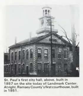
The current City seal was first presented to the City Council by Mayor George Latimer in 1979. The new design was based on research by a staff member in the Planning and Economic Development department that discovered that the old City Seal inaccurately represented the City’s original city hall building. The new seal, which featured an updated illustration of this historic building, was unanimously adopted by the City Council (see City Council File 87-1156), and officially recognized by the State of Minnesota, in 1987.
The first city hall was built 1856-1857 and completed May 1857. It was built on the corner of 5th Street and Washington Street, where the current Landmark Center stands. The lot was purchased from "Rice and Irvine's addition" for $1,500 on August 12, 1856, and a contract was signed with contractors Alpheus G. Fuller and George Scott for a $6,500 building. It was a two-story building. This building was used as the city hall until 1889, when the new combined city hall and county courthouse was finished.